Scube Enterprise Application
Scube Enterprise Application
Scube Enterprise Application
Case study
SaaS Dashboard (B2B)
6 Months

Intro
Intro
Intro
People don’t lose their business cards on purpose. They lose them the way anyone loses anything they only glance at once — in a jacket pocket, at the bottom of a conference tote, three contacts deep in a stack that never gets sorted.
Scube Enterprise Application turns that single paper card into a managed digital identity. Every employee gets an NFC card and a profile that updates itself; every organization gets one platform to issue them, brand them, and see what they actually produce. This case study covers the six-month journey from a scattered internal tool to an enterprise-grade networking and identity management platform.
People don’t lose their business cards on purpose. They lose them the way anyone loses anything they only glance at once — in a jacket pocket, at the bottom of a conference tote, three contacts deep in a stack that never gets sorted.
Scube Enterprise Application turns that single paper card into a managed digital identity. Every employee gets an NFC card and a profile that updates itself; every organization gets one platform to issue them, brand them, and see what they actually produce. This case study covers the six-month journey from a scattered internal tool to an enterprise-grade networking and identity management platform.
My Role
My Role
My Role
I led the design of the Scube Enterprise Application from 0 → 1, shaping both the product thinking and execution across employee and admin experiences.
I led the design of the Scube Enterprise Application from 0 → 1, shaping both the product thinking and execution across employee and admin experiences.
End-to-end UX design (Research → Delivery)
End-to-end UX design (Research → Delivery)
Design system and visual direction for a multi-role platform
Design system and visual direction for a multi-role platform
Information architecture for employee, admin, and card-lifecycle flows
Information architecture for employee, admin, and card-lifecycle flows
Cross-platform design (Web dashboard, employee profile, NFC card templates)
Cross-platform design (Web dashboard, employee profile, NFC card templates)
Collaboration with engineering on a three-tier AWS deployment
Collaboration with engineering on a three-tier AWS deployment
At a Glance
At a Glance
At a Glance
Platform
SaaS (B2B)
Duration
6 Months
Role
UX/UI Designer
THE PROBLEM
Picture a conference. Two hundred people, two days, a stack of cards exchanged at every table. A week later, most of those cards are gone — lost in a jacket pocket, buried in a drawer, or simply thrown away once the desk needed clearing.
Picture a conference. Two hundred people, two days, a stack of cards exchanged at every table. A week later, most of those cards are gone — lost in a jacket pocket, buried in a drawer, or simply thrown away once the desk needed clearing.
Contacts are never saved, leads disappear before anyone follows up, and the company that sent an employee to that conference has no way of knowing whether the trip produced a single new relationship.
Contacts are never saved, leads disappear before anyone follows up, and the company that sent an employee to that conference has no way of knowing whether the trip produced a single new relationship.
For an individual, that’s an inconvenience. For an organization managing hundreds of employees across dozens of events a year, it becomes something else entirely: a networking effort with real cost and effectively zero measurable return.
For an individual, that’s an inconvenience. For an organization managing hundreds of employees across dozens of events a year, it becomes something else entirely: a networking effort with real cost and effectively zero measurable return.
That was the starting brief — not “design a digital business card,” but figure out why the paper version keeps failing, and what a system would need to do differently to actually work.
That was the starting brief — not “design a digital business card,” but figure out why the paper version keeps failing, and what a system would need to do differently to actually work.
THE BUSINESS CHALLENGE
The business wanted more than a digital card. It needed employee profiles that stayed consistent with the brand no matter who was editing them, a way to generate and track leads instead of just exchanging contact details, and a system to manage the physical NFC cards themselves — ordering, activating, replacing — at the scale of an entire company.
The business wanted more than a digital card. It needed employee profiles that stayed consistent with the brand no matter who was editing them, a way to generate and track leads instead of just exchanging contact details, and a system to manage the physical NFC cards themselves — ordering, activating, replacing — at the scale of an entire company.
UNDERSTANDING THE USERS
Every decision on this platform had to satisfy two very different people at once. An employee wants to share their profile in the time it takes to shake a hand — no login screen, no friction, no thinking about it. An administrator wants the opposite: control, consistency, and a clear picture of what’s happening across hundreds of employees they’ll never personally supervise.
Every decision on this platform had to satisfy two very different people at once. An employee wants to share their profile in the time it takes to shake a hand — no login screen, no friction, no thinking about it. An administrator wants the opposite: control, consistency, and a clear picture of what’s happening across hundreds of employees they’ll never personally supervise.
EMPLOYEE
Employee
For an employee, the profile only works if using it takes less effort than reaching for a paper card.
The needs that came up again and again were quick sharing — a tap, not a login — and the ability to update a title or a phone number without waiting on IT.
The frustrations were the mirror image: manual contact sharing that made the digital card feel no faster than the paper one, and outdated information that lingered because updating it felt like filing a request instead of editing a field.
Every feature aimed at employees had to pass one test: does this make sharing an identity faster, or does it just add another step?
For an employee, the profile only works if using it takes less effort than reaching for a paper card.
The needs that came up again and again were quick sharing — a tap, not a login — and the ability to update a title or a phone number without waiting on IT.
The frustrations were the mirror image: manual contact sharing that made the digital card feel no faster than the paper one, and outdated information that lingered because updating it felt like filing a request instead of editing a field.
Every feature aimed at employees had to pass one test: does this make sharing an identity faster, or does it just add another step?
“I just want to tap my card and move on with the conversation.”
ADMIN
Admin
For an administrator, the platform only works if a hundred employees can be managed as easily as one.
The needs were about scale: managing entire teams at once, and maintaining a brand identity that stayed consistent no matter which employee was updating their own profile.
The frustrations were operational: inconsistent employee profiles that drifted from the brand the moment someone edited their own, and onboarding that meant manually setting up every new hire by hand.
Where employees wanted speed, administrators wanted leverage — the same action, repeated across hundreds of people, without repeating the work hundreds of times.
For an administrator, the platform only works if a hundred employees can be managed as easily as one.
The needs were about scale: managing entire teams at once, and maintaining a brand identity that stayed consistent no matter which employee was updating their own profile.
The frustrations were operational: inconsistent employee profiles that drifted from the brand the moment someone edited their own, and onboarding that meant manually setting up every new hire by hand.
Where employees wanted speed, administrators wanted leverage — the same action, repeated across hundreds of people, without repeating the work hundreds of times.
“I don’t need to control every profile. I need to trust that they’re all correct.”
AUDITING THE EXISTING PRODUCT
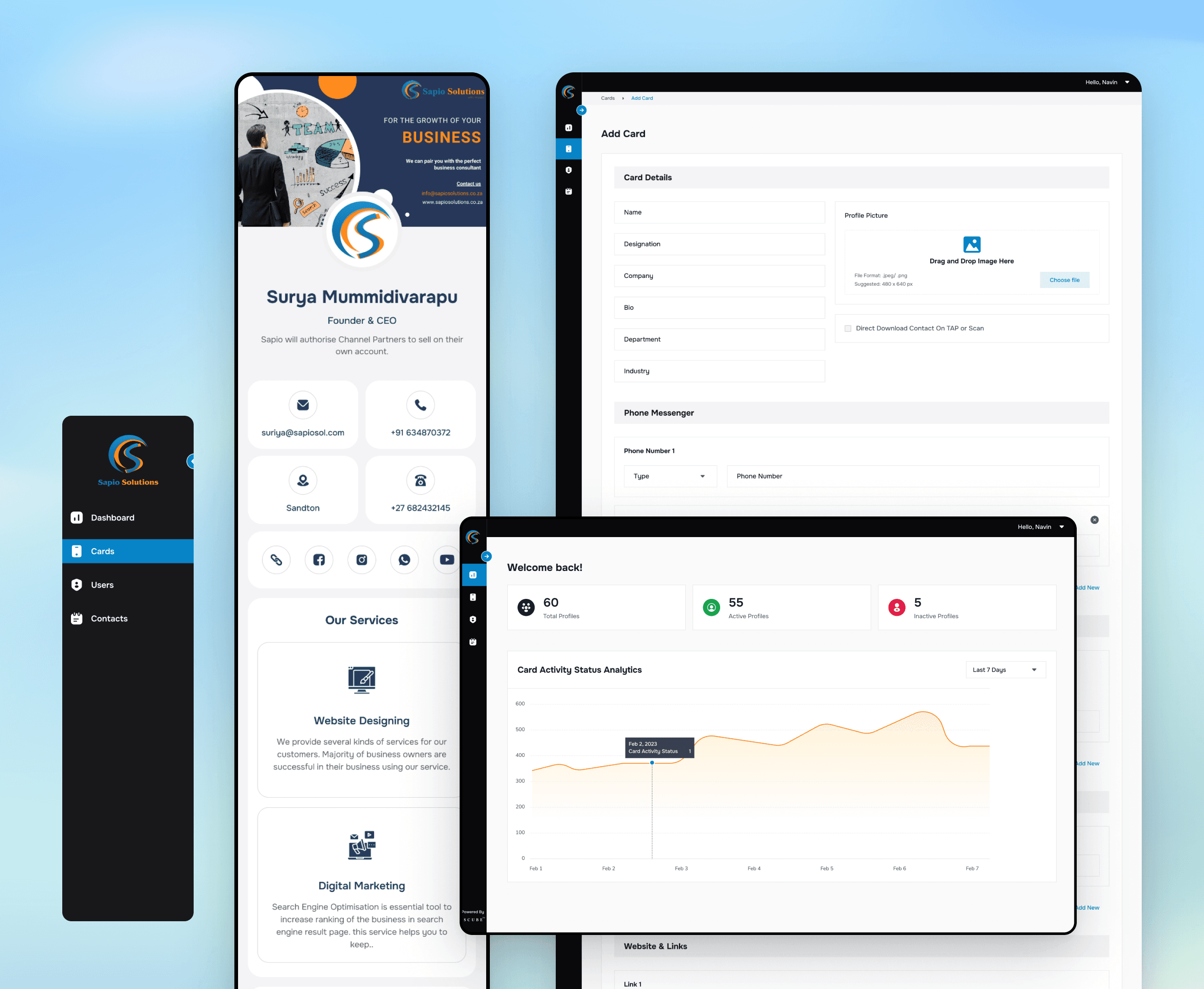
The existing product wasn’t a blank slate — it was a working internal tool that had grown feature by feature without ever being redesigned as a system. Before proposing anything new, the first job was understanding exactly where it was breaking down.
The existing product wasn’t a blank slate — it was a working internal tool that had grown feature by feature without ever being redesigned as a system. Before proposing anything new, the first job was understanding exactly where it was breaking down.
The usability problems were straightforward to name: difficult navigation, a high cognitive load for anything beyond the basics, and features that existed but that nobody could find. Underneath those, the codebase told its own story — no reusable components, inconsistent UI patterns from screen to screen, and a system too rigid to extend without touching everything around it.
The usability problems were straightforward to name: difficult navigation, a high cognitive load for anything beyond the basics, and features that existed but that nobody could find. Underneath those, the codebase told its own story — no reusable components, inconsistent UI patterns from screen to screen, and a system too rigid to extend without touching everything around it.
At the product level, the gaps were bigger than UI polish. Entire enterprise modules that organizations needed — proper role management, structured workflows — simply didn’t exist yet, which meant admins were stitching together manual processes to cover what the software should have done, and every new hire meant a difficult, hands-on onboarding rather than a repeatable one.
At the product level, the gaps were bigger than UI polish. Entire enterprise modules that organizations needed — proper role management, structured workflows — simply didn’t exist yet, which meant admins were stitching together manual processes to cover what the software should have done, and every new hire meant a difficult, hands-on onboarding rather than a repeatable one.
Three categories, one root cause: the product had been extended for years without anyone stepping back to design it as a coherent system. That was the case for rebuilding it properly, not patching it again.
Three categories, one root cause: the product had been extended for years without anyone stepping back to design it as a coherent system. That was the case for rebuilding it properly, not patching it again.
COMPETITIVE ANALYSIS
We looked at what was already on the market — Popl, HiHello, and Blinq among them — to understand what problems were already solved and where the real opening was.
We looked at what was already on the market — Popl, HiHello, and Blinq among them — to understand what problems were already solved and where the real opening was.
Popl had built a strong NFC ecosystem but wrapped it in complex workflows. HiHello made sharing genuinely easy with a modern profile experience, but offered little in the way of enterprise management. Blinq nailed fast setup and a simple UX, at the cost of administrative control.
Popl had built a strong NFC ecosystem but wrapped it in complex workflows. HiHello made sharing genuinely easy with a modern profile experience, but offered little in the way of enterprise management. Blinq nailed fast setup and a simple UX, at the cost of administrative control.
Each one was good at exactly one side of the problem — the individual experience or the administrative one — and none of them treated digital identity, team management, lead tracking, and brand governance as parts of a single system.
Each one was good at exactly one side of the problem — the individual experience or the administrative one — and none of them treated digital identity, team management, lead tracking, and brand governance as parts of a single system.
That gap — building all four into one coherent platform instead of picking a side — is where Scube needed to differentiate.
That gap — building all four into one coherent platform instead of picking a side — is where Scube needed to differentiate.

What We Had to Solve
What We Had to Solve
01
Employee profiles that drift out of brand the moment someone edits their own.
Employee profiles that drift out of brand the moment someone edits their own.
02
Networking that produces contacts but no trackable leads or outcomes.
Networking that produces contacts but no trackable leads or outcomes.
03
NFC cards with no lifecycle system — no clean way to order, activate, or replace them at scale.
NFC cards with no lifecycle system — no clean way to order, activate, or replace them at scale.
04
Zero visibility into whether any of this networking activity was actually working.
Zero visibility into whether any of this networking activity was actually working.
PRODUCT VISION
The vision that came out of research and competitive analysis was simple to state and hard to build: create a unified platform where employees can share their professional identity effortlessly, while organizations maintain complete control over branding, teams, and networking performance.
The vision that came out of research and competitive analysis was simple to state and hard to build: create a unified platform where employees can share their professional identity effortlessly, while organizations maintain complete control over branding, teams, and networking performance.
Designing the Platform
Designing the Platform
Designing the Platform
The Dashboard
Administrators needed an immediate overview of organizational performance the moment they logged in. The dashboard was built around four numbers that actually mattered — profile views, leads, appointments, and employee activity — so admins could spot a trend in the time it took to open the page, rather than digging through reports to find one.
Administrators needed an immediate overview of organizational performance the moment they logged in. The dashboard was built around four numbers that actually mattered — profile views, leads, appointments, and employee activity — so admins could spot a trend in the time it took to open the page, rather than digging through reports to find one.
Administrators needed an immediate overview of organizational performance the moment they logged in. The dashboard was built around four numbers that actually mattered — profile views, leads, appointments, and employee activity — so admins could spot a trend in the time it took to open the page, rather than digging through reports to find one.

Lead Management
Networking only creates value if the leads it generates can actually be worked. That meant the lead list itself needed to function like a real tool, not an export button bolted onto a contacts page — fast to search, easy to filter, quick to act on, and simple to pull into whatever CRM or spreadsheet the sales team already lived in.
Networking only creates value if the leads it generates can actually be worked. That meant the lead list itself needed to function like a real tool, not an export button bolted onto a contacts page — fast to search, easy to filter, quick to act on, and simple to pull into whatever CRM or spreadsheet the sales team already lived in.
Networking only creates value if the leads it generates can actually be worked. That meant the lead list itself needed to function like a real tool, not an export button bolted onto a contacts page — fast to search, easy to filter, quick to act on, and simple to pull into whatever CRM or spreadsheet the sales team already lived in.

Teams at Scale
As an organization grows, the hard part stops being creation and starts being consistency. A hundred new hires shouldn’t mean a hundred manual setups, so the platform was built around bulk onboarding, role-based permissions, defined team structures, and performance tracking that worked the same way whether an admin was managing five people or five hundred.
As an organization grows, the hard part stops being creation and starts being consistency. A hundred new hires shouldn’t mean a hundred manual setups, so the platform was built around bulk onboarding, role-based permissions, defined team structures, and performance tracking that worked the same way whether an admin was managing five people or five hundred.

NFC Card Lifecycle
The physical card turned out to be its own product. Every card needed to be ordered, activated, and eventually deactivated or replaced — and once organizations were managing hundreds of them, that couldn’t be an ad-hoc process handled over email. It became a complete lifecycle system in its own right, sitting underneath the software experience.
The physical card turned out to be its own product. Every card needed to be ordered, activated, and eventually deactivated or replaced — and once organizations were managing hundreds of them, that couldn’t be an ad-hoc process handled over email. It became a complete lifecycle system in its own right, sitting underneath the software experience.
The physical card turned out to be its own product. Every card needed to be ordered, activated, and eventually deactivated or replaced — and once organizations were managing hundreds of them, that couldn’t be an ad-hoc process handled over email. It became a complete lifecycle system in its own right, sitting underneath the software experience.

Branding System
Organizations wanted their employees to feel individuality without losing brand consistency — a genuinely difficult balance. The answer was a template-driven architecture: brand colors, logos, and layout variations that teams could adjust within boundaries administrators set, so personalization and governance could both be true at once.
Organizations wanted their employees to feel individuality without losing brand consistency — a genuinely difficult balance. The answer was a template-driven architecture: brand colors, logos, and layout variations that teams could adjust within boundaries administrators set, so personalization and governance could both be true at once.
Organizations wanted their employees to feel individuality without losing brand consistency — a genuinely difficult balance. The answer was a template-driven architecture: brand colors, logos, and layout variations that teams could adjust within boundaries administrators set, so personalization and governance could both be true at once.

SCUBE DESIGN SYSTEM
Every screen in this platform draws from one shared design system — spacing, type, color, and component rules built once and reused everywhere, so a new feature never has to start from a blank canvas or reinvent a pattern that already exists three screens over.
Every screen in this platform draws from one shared design system — spacing, type, color, and component rules built once and reused everywhere, so a new feature never has to start from a blank canvas or reinvent a pattern that already exists three screens over.
That consistency is what let a small team ship a genuinely large surface area — dashboards, employee profiles, card management, onboarding flows — without the product fragmenting into a dozen slightly different visual languages along the way.
That consistency is what let a small team ship a genuinely large surface area — dashboards, employee profiles, card management, onboarding flows — without the product fragmenting into a dozen slightly different visual languages along the way.

The Final Ecosystem

Employee Digital Profile

Admin Analytics

Employee's NFC Card
Employee Digital Profile
Admin Analytics
Employee's NFC Card
OUTCOMES
UNIFIED BRAND PRESENCE
A consistent brand identity, maintained automatically across teams, departments, and regions — standardized digital business cards and employee profiles mean no one is improvising their own version of the company’s look.
A consistent brand identity, maintained automatically across teams, departments, and regions — standardized digital business cards and employee profiles mean no one is improvising their own version of the company’s look.
SIMPLIFIED ADMINISTRATION
HR and operations teams manage employee profiles, card distribution, and updates from a single platform, cutting the manual effort and administrative overhead that used to come with growing the team.
HR and operations teams manage employee profiles, card distribution, and updates from a single platform, cutting the manual effort and administrative overhead that used to come with growing the team.
ACTIONABLE NETWORKING INSIGHTS
Profile views, card shares, link clicks, and engagement metrics turn networking from a soft, unmeasurable activity into something with a trackable return — the visibility the business asked for at the very start of this project.
Profile views, card shares, link clicks, and engagement metrics turn networking from a soft, unmeasurable activity into something with a trackable return — the visibility the business asked for at the very start of this project.
Impact
Impact
Impact
80K+
80,000+ employees managed across every organization on the platform.
80,000+ employees managed across every organization on the platform.
30K+
30,000+ NFC cards supplied and tracked through their full lifecycle.
30,000+ NFC cards supplied and tracked through their full lifecycle.
50+
50+ enterprise teams onboarded onto a single, unified platform.
50+ enterprise teams onboarded onto a single, unified platform.
REFLECTION
Design for two audiences as one system — the employee’s five-second share and the admin’s five-hundred-person rollout are the same product, not two.
Design for two audiences as one system — the employee’s five-second share and the admin’s five-hundred-person rollout are the same product, not two.
Consistency is a feature, not a constraint — the template-driven branding system proved that personalization and governance don’t have to trade off against each other.
Consistency is a feature, not a constraint — the template-driven branding system proved that personalization and governance don’t have to trade off against each other.
The hardest problems weren’t visual — they were architectural. Role management, card lifecycle, and multi-tenant branding needed solving before any screen could be designed well.
The hardest problems weren’t visual — they were architectural. Role management, card lifecycle, and multi-tenant branding needed solving before any screen could be designed well.